10 Great Consulting Websites Examples
For today’s collection, we’ve chosen 10 awesome consulting website examples for different industries. They are engaging, good-looking, and know how to highlight their services.
We’ve picked different design approaches, modern ones with stylish animation effects and visuals in the spotlight, as well as more classical ones with a focus on the information.
You’ll find ideas for the education business, software consulting, coaching expertise, and more.
Want to automate consultation appointment bookings? Check out the BookingPress plugin.
Baker Tilly – Strategy & Management Consulting
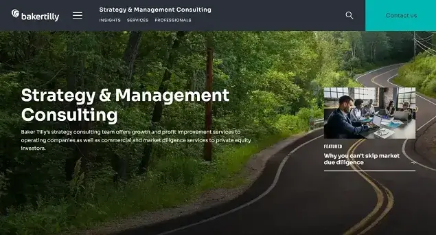
Baker Tilly Consulting’s website features a clean, modern, and aesthetic design. Featured posts, like dynamic headlines on a ticker tape but in a small format, slide across the front page, showcasing the messages the company wants to focus on.
The Team page features a diverse group of experts, each with their own title and contact information. The “Subscribe to Newsletter” button is prominently displayed to encourage clients to get the news from the business. The website also serves regional needs with a Location by State section, clearly displaying the firm’s offices across the map.
What’s more, you can see the company’s activity by heading to the Upcoming Events section or visiting the Client Portal, which provides a dedicated space for existing clients.
William Clarence – Education Consultant Website Example

William Clarence, an education consultant website guides students through the world of college applications with elegance and expertise. A nice header image showcasing college students creates a pleasant first experience.
This website offers tailored services for different college levels, each clearly outlined with round buttons at the footer for easy navigation. Getting in touch is not so easy online, the website provides multiple ways to reach the company, such as by calling the phone number or writing an email.
In Germany – Federal Government Consulting Website Example
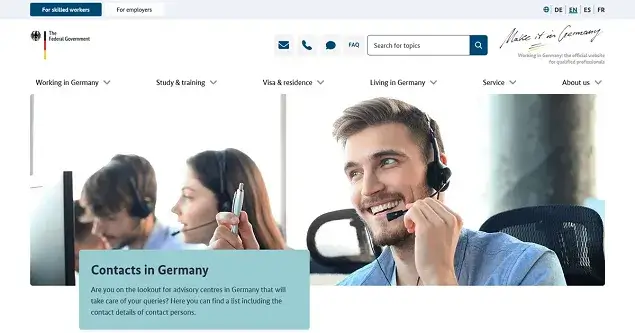
Our next website example takes the frustration out of finding the help you need in the complex world of German federal consulting. This website greets you with a mighty mega menu – numerous options, neatly organized by the topics.
For any inquiry, pre-filled options save you time and ensure your inquiry reaches the right hands; there is also an FAQ section to help clients. A handy search bar in the navigation menu sits prominently, too. There are also convenient shortcuts – email, call, or message options to let clients contact the consulting faster and easier. All in all, every element, from the mega menu to the quick contact options, this website is designed to empower clients to find the answers they need.
BlueGrid – Software Consulting Company Website Example
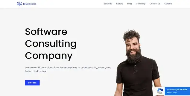
If you’re looking for a solution that ticks all the boxes – clean design, clear navigation, and engaging content – BlueGrid is a great example of a consulting website. Pages load in a blink; the minimalist design, free from clutter, ensures the website visitors immediately notice the things they are looking for (these are of course their areas of expertise).
Case studies tell the story of successful projects, while client logos act as testimonials, highlighting the user experience with the services. Their library, brimming with downloadable ebooks and white papers, brings another added value to the services. There is a contact form along with Google Maps for instant contacts.
Eagle Hill – Federal & Financial Services Consulting
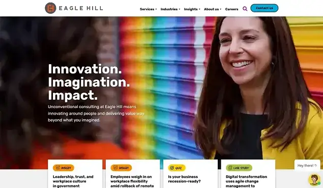
This website is a nice example of top management consulting, financial services, and other high-powered industries; yet, it’s full of vibrant colors, playful animations, and a captivating background video on the front page featuring real clients and industry experts. They prominently feature their team members, complete with photos and areas of expertise.
They feature dedicated sections showcasing the latest research articles and industry reports, their location, and quick contact forms.
HandsOn – Marketing & Sales Consulting Example
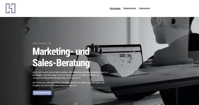
This website in German with a great name, HandsOn, resonates with German audiences and inspires them to trust the marketing and SEO expertise of the company. Bite-sized descriptions of the company services provide information at a glance without the fluff, so if people want to get a proper consultation, they just need to contact the expert.
As you probably know, data protection is paramount in Germany. This website dedicates a full page to it, addressing concerns head-on with transparent explanations on data collection, usage, and storage.
Ashcroft – Legal Consulting Website Example
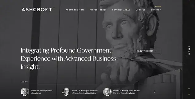
A monochrome website example of a legal firm. Smooth animations add a touch of dynamism without sacrificing the overall minimalist aesthetic. This website shines a spotlight on its professionals, showcasing their biographies in detail.
Clear categories of practice areas, like “Crisis Management” or “Election Law,” lead clients to dedicated pages. A simple contact form invites clients to connect with the right expertise directly.
The Parent Practice – Parent Consulting Website Example

The Parent Practice is a website as vibrant and dynamic as the challenges of parenthood itself. The parenting coach personality is in the spotlight. Each category of consulting available is very detailed – descriptions, insightful blog posts, course application forms, and more.
There is also a curated shop with valuable materials, including multiple freebies, podcasts, and even Instagram feeds filled with heartwarming images and short video clips from the parenting coach. Parents can contact a coach via a detailed contact form.
Taxes Oncology – Telemedicine Consulting
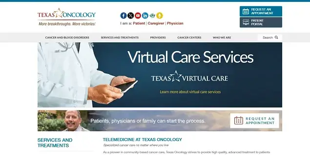
This website doesn’t overwhelm website visitors with unnecessary information. Instead, it presents a clear and concise list of services, each tailor-made for specific medical needs.
This website makes requesting a telemedicine consultation effortless with a dedicated ‘request an appointment’ button in the header and on the page. It’s an invitation to a face-to-face meeting very needed for the services businesses.
AlaCarte Consulting Group – Restaurant Consulting
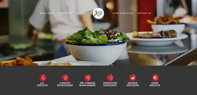
AlaCarte Consulting Group’s website explodes with high-resolution photos of delectable dishes and stylish interiors. A prominent “Request Consulting” form makes it easy for anyone to book a consultation. AlaCarte’s website also displays logos of renowned clients on the dedicated page to show that these consultants can be trusted. It’s a very simple website with yet effectively presented business.
More articles for you:
- 5 Best Website Builders for Lawyers Compared
- How Online Booking Plugin Will Help Legal Consultant Firms
- Trends in Appointment Scheduling

Get BookingPress Premium
50+ Premium Addons
20+ Payment Gateways
Plan starts at just $69
Get Premium Now


