20+ Must-See Real Estate Photographer Website Examples

Not all photographers are the same: just like a carpenter wouldn’t specialize in every wooden creation, not every photographer possesses a keen eye for all genres of photography.
When it comes to capturing the best image of any property, a real estate photographer brings a unique skill set different from creative or personality photographers.
Also, want to offer your real estate photography services? Seeking inspiration as to how to build a professional online presence? This article showcases examples of well-designed real estate photographer websites. By exploring their visual approach and website design, get ready to get insights into how professionals effectively present their work.
Related articles:
- How to Manage Real Estate Appointments in WordPress
- How to Choose Online Hotel Booking Software?
- Equipment Rental Services Guide: What You Should Know
Profoto Design
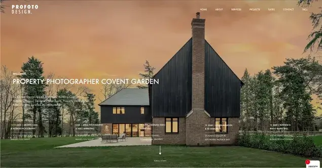
The website features a large hero image slider showcasing various modern houses, vacation rentals, residential areas, and architectural monuments. The navigation bar is simple and easy to use. The color palette is limited to a few neutral colors, such as black, white, and gray. You’ll find many full-width grid sliders, with base photo rates featured on the inner pages.
Toy Media
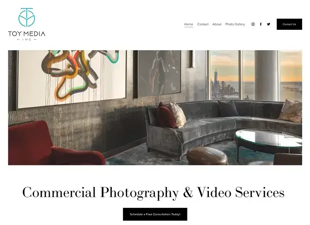
The front page is rather modest, it features a large hero image that showcases a modern house’s interior. This is a great way to grab attention and give potential clients a taste of the photographer’s style and expertise. The website includes several calls to action, such as a “Schedule a Free Consultation Today” button. This makes it easy for potential clients to get in touch with the photographer and learn more about their services. The Toy Media website also features a categorized photo gallery with real estate photography and other related areas.
Lens85
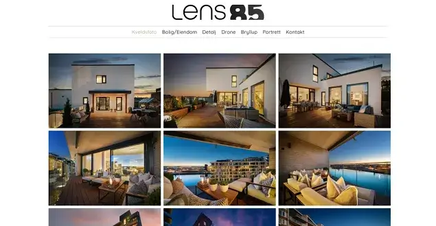
The Lens85 real estate photographer website example features numerous images on one page, for each category. It’s a great way to give your customers options to view as many images as possible and showcase the photographer’s ability to capture different aspects of a property. The gallery is well-organized and easy to navigate, and it features a variety of different types of properties.
Nicolas Doyle Photography
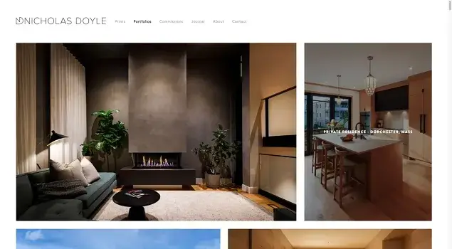
The website uses a clean and uncluttered design with a focus on large, high-quality images, neatly optimized in a professional grid. Interesting fact: the contacts page showcases a video of a photographer at work. The text on the website is clear and concise.
NYC Property Photography
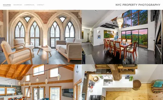
Many real estate photography websites use large hero images, but this website uses a collage of full-width multiple images that span across the site instead of a single image. This collage approach allows the photographer to showcase a variety of their work and styles in one place and give an immersive experience to customers. The navigation bar on NYC Property Photography is sticky, which means that it stays at the top of the page even when the user scrolls down.
Nuvu
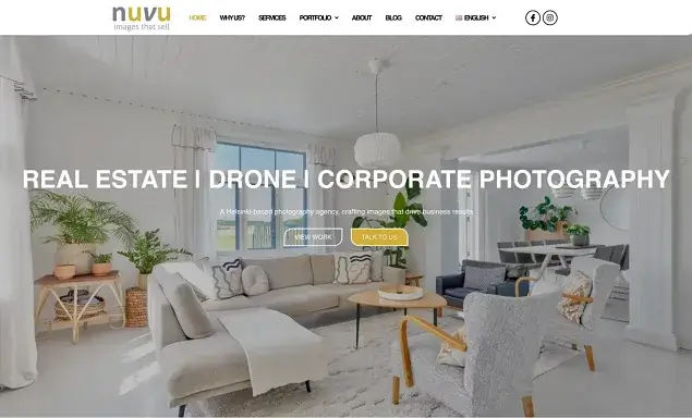
As for unique features, this website has a zooming effect on the hero image on the front page, and testimonials, which are indeed rare, because most real estate photographers rely on their portfolios to speak for themselves.
Seelen Plus
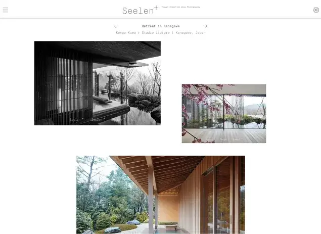
Specializing in capturing the architectural details and unique character of historical properties, the Seelen brand welcomes you with a very creative asymmetrical grid design on the front page. The distinctive feature of this real photographer website example is a huge categorized menu that showcases various locations and various photographers. The website has a professional and sophisticated look.
Greg Moine
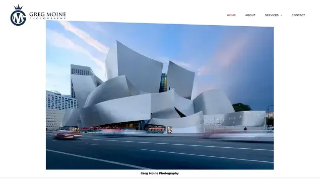
A large hero image showcasing a captivating architectural piece, instantly grabbing the viewer’s attention and setting the tone for the photographer’s style, it also changes to another one on hover. The website utilizes a grid-based layout for both content and image presentation, maintaining a structured and organized appearance.
Husfoto
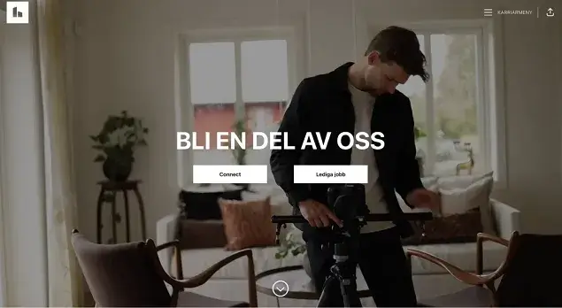
A website is a network of professional real estate photographers and videographers across Sweden. It doesn’t provide a lot of images, instead focusing on a team. Among interesting website design solutions are animated counters and a handy hamburger-like menu.
Mark Herboth Photography
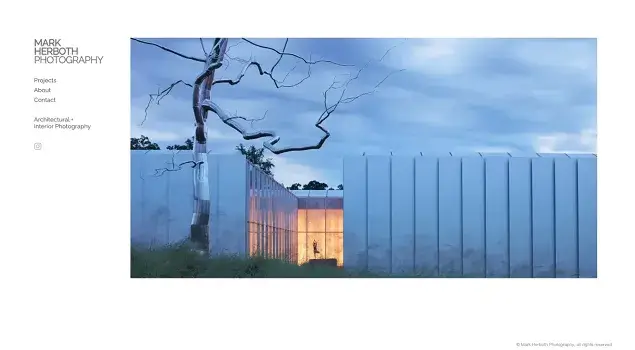
The front page focuses on a single image that transitions into a slider. Subsequent pages display multiple image grids. Overall, the website exudes an ultra-minimalist aesthetic.
Fortune Stagers

This website showcases a number of photography categories, including real estate photography and commercial staging. It looks more like classical website products featuring social buttons and Google Maps integrated.
Luxe Life Productions
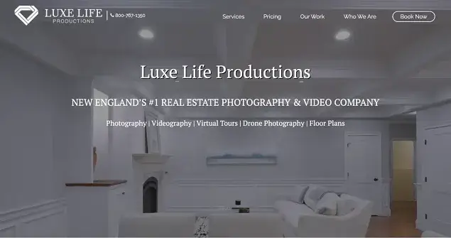
Luxe Life Productions in Boston is a real estate photographer website that features a full-screen homepage presentation video and multiple real estate services. Clients can also click on the book now button to send their request.
Sing Shots
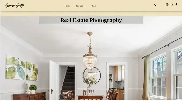
A very simple website that features real estate photography and videography services and includes prices and packages based on the number of photos.
Clyde Digital
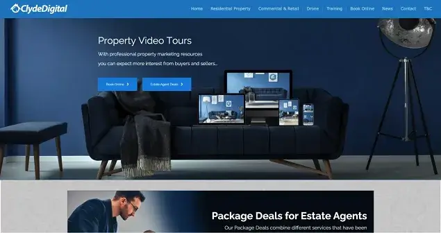
This real estate photographer website example offers multiple commercial services including residential property, real estate drone photography, and commercial and retail photography. It also includes a booking widget which helps clients book a photographer for a specific time online and pay instantly.
The Walters Group
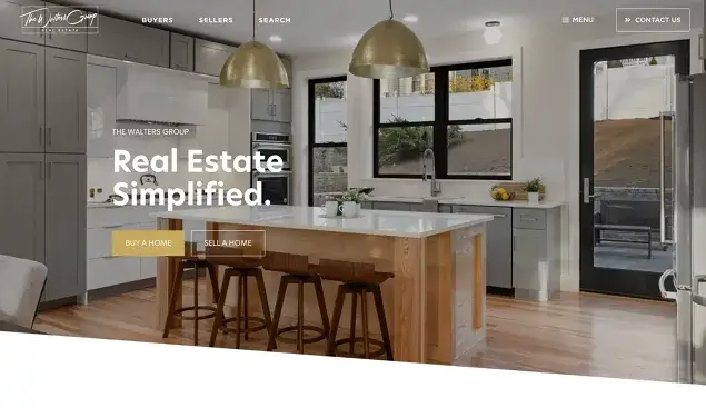
This is actually a real estate company website that among other services offers real estate photography as well as videography. It focuses on a few images of seller and buyer services, also offering a few directories to find a home and assess the home’s value.
Elevated Photos
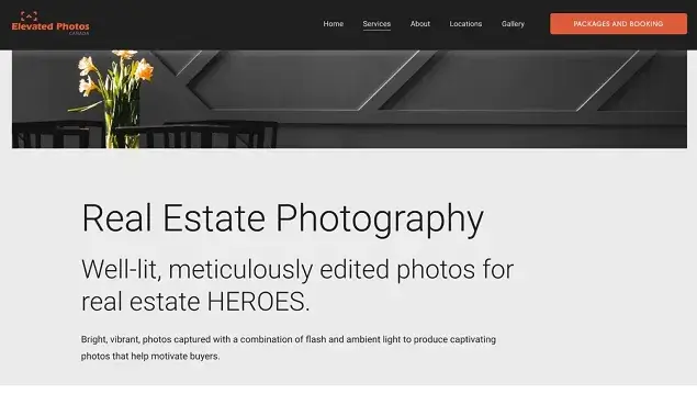
The introductory hero part of this website focuses on text and calls to action instead of images. All the real estate property portfolio images are located below. So it has a feeling like you are scrolling through the blog. A nice thing is also that they have the packages and booking button, which allows you to go through simple steps and book a photography service right away, powered by the Acuity Scheduling software.
Luova Helsinki
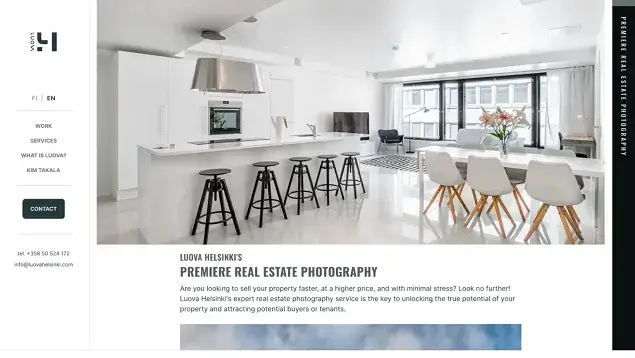
Luova is a nice combination of text and images. The services are provided in Finland so it makes sense to add a language switcher and serve the audience that speaks only English, which is a very common thing in this country. Photos are located in a simple list which makes it easy to scroll through all of them.
Sabine Soltnere
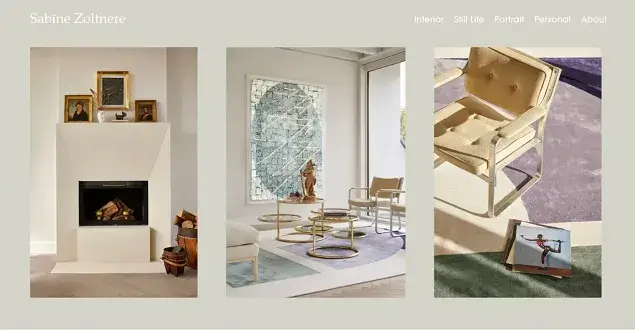
It’s a personal portfolio of a photographer who works with various genres – interior, real estate, portraits, and many more. It’s a very sophisticated design with lightweight grids, with a great touch of elegance.
London Property Photography
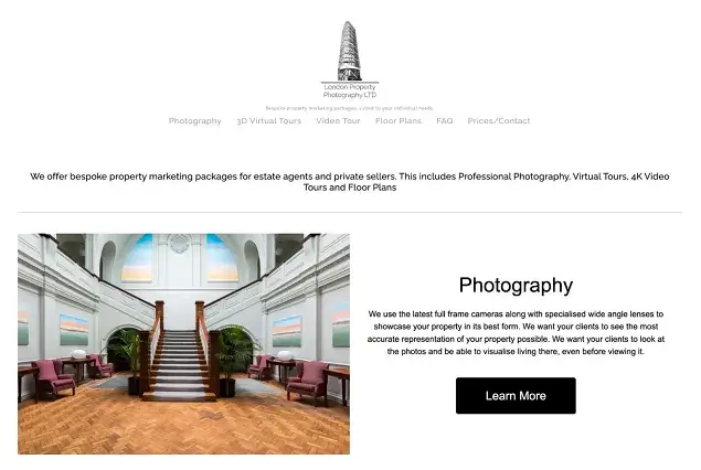
London Property Photography offers various services, including real estate photography, 3D virtual tours, and 4K video tours for any property. They can also capture floor plan images. You can easily obtain a price quote by filling out a form on the “contact” page. The website boasts a clean and minimalist design.
Property Photos
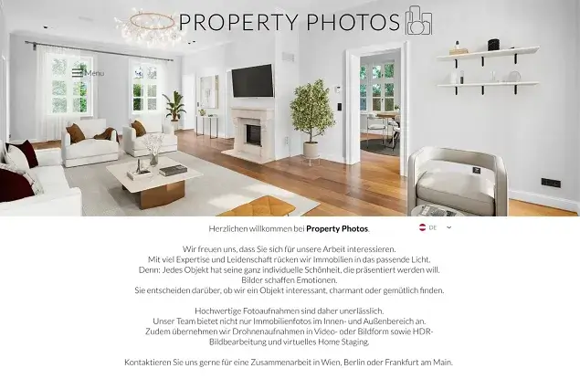
The property photos website focuses completely on wide and full-width images, image grid galleries, and even before and after results.
Relavix
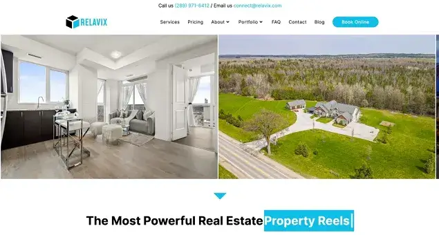
It’s a classical example of a real estate photography company with all the business features included. For example, Google reviews embed popular services with the view video buttons, popular packages with pricing and details, selected works featured in a grid gallery, FAQs, and even a booking wizard that helps customers choose services step by step to book them online.
Andy Ryan Photographer
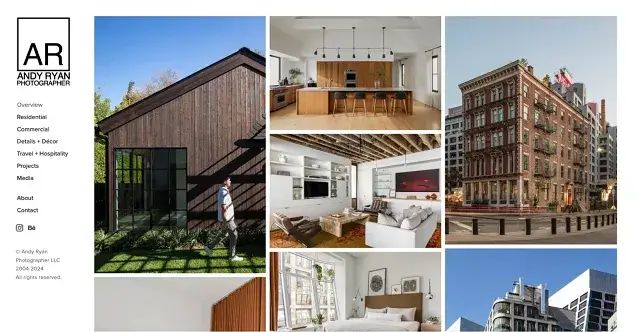
Andy Ryan is a professional commercial and editorial photographer based in New York, specializing in architecture and interiors. His website is an example of an often-chosen design with the menu in the website sidebar and images in the spotlight.
Related articles for photographers:

Get BookingPress Premium
50+ Premium Addons
20+ Payment Gateways
Plan starts at just $79
Get Premium Now


